
Welcome to The Friday Face-Off, a new weekly meme hosted by Books by Proxy. Join us every Friday as we pit cover against cover, and publisher against publisher, to find the best artwork in our literary universe.
The Friday Face-Off: Shall be Blade that Was Broken
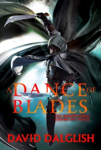
A Dance of Blades (Shadowdance #2) by David Dalglish

asdf
asdf
a
asdfsdfasdf
VS.
asdf
asdf
asdf
asdf
CreateSpace – US Cover

Cover art by Peter Ortiz
◊ ◊ ◊
Orbit – UK Cover

Cover art by Michael Frost and Gene Mollica
The Friday Face-Off Winner is…
Orbit – UK Cover;
Cover art by Michael Frost and Gene Mollica
Looking at these covers from afar (or as thumbnails) the US cover stands out a lot more than. I liked the colored pencil sketch style and how the women’s clock comes up as a faded red on the bottom on the cover. Reminded me a lot of Sam Green’s style, and I thought this might have been some of his earlier work. Upon closer inspection, I saw some flaws…
The colors all look slightly dull, and the artistic skill – while is a million time greater than myself – left my underwhelmed when I first saw it. I thought the US was going to have something special to it, but I was wrong.
Meanwhile, the UK cover has nothing wrong!
Great design on the assassin(? – I have not read these books) on the cover that perfectly matches the title of the book. Title of the book is a great font and style choice – and do you notice how the letter are slight see through where it cover over the character’s body? Plus, these colors are amazingly bright and bold. What I think I love most about this cover, is how the blade actually goes from behind the title, through, and over the word. So freaking cool, and I believe there was a cover last weeks (from @BooksByProxy?) that did the same thing.
Fun Fact: This Orbit cover is technically both a UK and US cover. Dalglish’s Shadowdance series was original self-published in the US through CreateSpace back in 2010. However, when Orbit picked the series up and published it in 2013, it was release in both the US and UK, at the same time with that same cover.
Which cover do you think is the best?
-DJ

Have to agree with you and pick the UK cover though the blades the assassin is holding in the US cover look awesome.
LikeLike
It’s a very polished cover, the UK. US has a slight “amateur” look to it.
LikeLiked by 1 person
I do like the US cover but I agree with your choice too to be honest. I like the stance and the blade (like TTBG) but I still prefer the other – maybe because I’m already familiar with this series and these particular covers which I do find eye catching.
Now I think about it the clock kind of reminds me of the cover on my choice this week.
Lynn 😀
LikeLike
If you have been reading a books series, and enjoying it a lot, I bet that does effect you opinion on the cover; your feeling for the story, indirectly going to the cover, too.
LikeLike
Both these covers are fantastic but I just can’t resist the UK covers! They’re so dynamic and swirling and swords and ahhhh! Love! And I’m noticing those title interactions everywhere now 😉
LikeLike
“Dynamic” is a good word! And I’m totally seeing those title interactions around too! Never really noticed them before you cover the other week, but yeah, not I am noticing them around more XD
LikeLike
Actually, I think the “UK” one is actually used for both the US and UK Orbit editions. The old createspace covers were from when they were self-published before they were bought (and I do not like them at all, lol. The new versions are much much better.)
LikeLike
Or durrr, never mind, I just scrolled down and saw your “fun fact” 😛
LikeLiked by 1 person
Oh yes, I double check my sources before I post anything XD I wonder why they decide to do that though? Cheaper and less of a gamble because he was a new author, previous self-pub? But this was his second book in the series, so I don’t know about that theory…
LikeLike
UK-Orbit cover for me. I love the look to the assassin and the cover layout.
LikeLike
Orbit is very smooth, polished, and professional.
LikeLiked by 1 person
Yes… I think the Orbit cover wins – although I do like the overall idea of the original cover, which has great flow and energy. But you’re right, the female figure isn’t particularly well drawn, which is a shame and there is a sense of tension and mystery in the shrouded figure in the Orbit cover which is lacking. A lovely choice, though. I haven’t read the books, either, but the covers do look tempting!
LikeLike
I think that if both cover were done by the same artist or same art style, the US cover would have won, because I like the assassin’s stance and that red cape thing, too much.
LikeLiked by 1 person
[…] S J Higbee @ Brainfluff – The Fell Sword by Miles Cameron […]
LikeLike